If you do not make mistakes, you do not make anything. Probably, you have already heard this well-known idiom once upon a time. Yet, what about making web design mistakes that truly hurt your website's performance? Take it easy because we are not going to judge you for the errors of the past. Furthermore, we cannot invent the time machine to help you fix them. However, our blog is a safe place intended to help you improve your skills, so we prepared an awe-inspiring list of web design mistakes to avoid.
So, just make yourself comfortable, and we will provide you with several insights concerning the top 10 mistakes in web design and meaningful pieces of advice on how to avoid them.
1. Bad Search
There is no doubt that the search option is a genuine lifesaver when it comes to surfing the web. Nevertheless, this design tool has two sides of the coin. On the one hand, it always comes to help when website navigation fails. On the other hand, search engines prioritize results solely based on the number of query terms they contain. To put it another way, the context and importance of a page are not taken into account. Hence, such a poorly-organized browsing experience may turn into an absolute nightmare for the users, especially elderly ones.
SolidBrain Recommends:
-
First of all, customize your search engine so that it can call out valuable content at the top of the list. This technique will be primarily useful for your key queries, such as the names of your services and so on.
-
Instead of advanced search and scoping, put an emphasis on a simple search box on the homepage. The more straightforward and visible it is, the more convenient it can be for the users.

2. Neglecting Priorities
Suppose a situation: you want users to be able to upload a profile picture. However, if you add a function to crop, scale, rotate or edit the photo, it will complicate the design too much. In fact, adding a "rotate" or "crop" button to the interface is easy, but it is much more challenging to implement this feature in the actual development. What do we get as a result? Designers often introduce features that complicate the development process without adding any value to the website. Consequently, poorly organized priorities take the second position on our list of web design mistakes.
SolidBrain Recommends:
-
When prioritizing features, you need to pay extra attention to the business goals, the scope of the project, time limitations, and development strategy.
-
Moreover, it is better to avoid adding functionality unless it plays a pivotal role in your website or app.
-
Always prioritize business and end-user goals above useless functionality that just looks fancy.
3. Underestimating User Context
One of the common web design mistakes is underestimating user context.Various contextual factors influence user behavior when interacting with an interface. Therefore, it is essential to consider where users are when they use the website, how much time they have, and how they are feeling. By way of illustration, think at least of a standard sleep cycle app. It has a soothing dark background that does not irritate the eyes, so it benefits users who set their alarm before bed.
SolidBrain Recommends:
-
When preparing for the design process, do not neglect the target audience research. For example, what is the desired action of your target audience? Whether they prefer reading blog posts or buying your goods/services, you can easily optimize specific pages with this crucial information in mind.
-
It would be an excellent idea to utilize Google Analytics in order to consider the following metrics: how much time users usually spend on the website, how old they are, and which part of the day is the most convenient for them, etc.
-
The best way to ensure the UI /UX designs fit the user context is to run them in test mode.
4. Lack of Versions for People with Disabilities
Creating a design is like building a public building, such as a library or a school — you should take into account the needs of a wide variety of individuals, including people with disabilities. The same with design: ignoring diverse types of users may become a significant web design mistake that will harm the overall brand's philosophy. Reducing text to 8 pixels because it fits better in horizontal space or using a lighter shade of gray because it looks good creates challenges for visually impaired users. Sure, you can collect a lot of likes on Dribbble, but when developing a product for real people, you should prioritize their experience.
SolidBrain Recommends:
-
In addition to aesthetically pleasing visuals, do not forget about the characteristics of various users who will interact with the website.
-
Consider the Americans with Disabilities Act (ADA).
-
The Web Content Accessibility Guidelines (WCAG) state that the contrast should be at least 4.5:1. This guideline also includes recommendations for people with various impairments.

5. Copying Other People's Work or Blindly Following Trends
The world of Dribbble, all those cute animations, and gradients is very addictive. As a result, the initial design tasks are quickly forgotten. After several hours of research, the functionality of the cute project published on Dribble tends to look more and more appealing, so designers often try to include it in their own works. Although it is great to look for inspiration on Dribbble and other social networks, it does not mean you have to copy and paste UI components directly from them because they look original or trendy.
SolidBrain Recommends:
-
To avoid these common website design mistakes, get inspired instead of copy pasting.
-
Consider long-term benefits above fast-moving trends. At the beginning, trendy ideas may look promising, but they typically have little to no value in the long run.

6. PDF Files for Online Reading
As we have already sorted out, you should always think about UX first. PDFs are great for printing or distributing documents. Still, such files often confuse users by interrupting their flow with unnecessary actions, such as downloading a PDF file and opening it on your PC or within a particular browser. PDF files often include tiny fonts and undifferentiated content, and these unexpected inconveniences definitely were not involved in the plan of users that visited your website.
SolidBrain Recommends:
-
Try to avoid adding PDF files by converting any information that needs to be read on the screen into actual web pages.
-
If it is still necessary to use PDFs, take care of their content (e.g., fonts, size, table of contents) so that users will not be confused.

7. A Terrible CTA
CTA, which stands for call to action buttons, is a robust design tool that can easily boost your marketing & sales strategies. At the same time, it also appears to be one of the most common mistakes in website design. Notably, CTA is like a crucial identification mark that can both guide users to conversions or confuse them. Therefore, with a poorly designed CTA, your target audience will have less motivation to interact with your website, which will eventually cause a loss of interest.
SolidBrain Recommends:
-
A carefully designed CTA will help you catch customers' attention and help you convert hot prospects of the website.
-
What is more, it is necessary to create a CTA that is both unique and creative while also meeting the business goals.

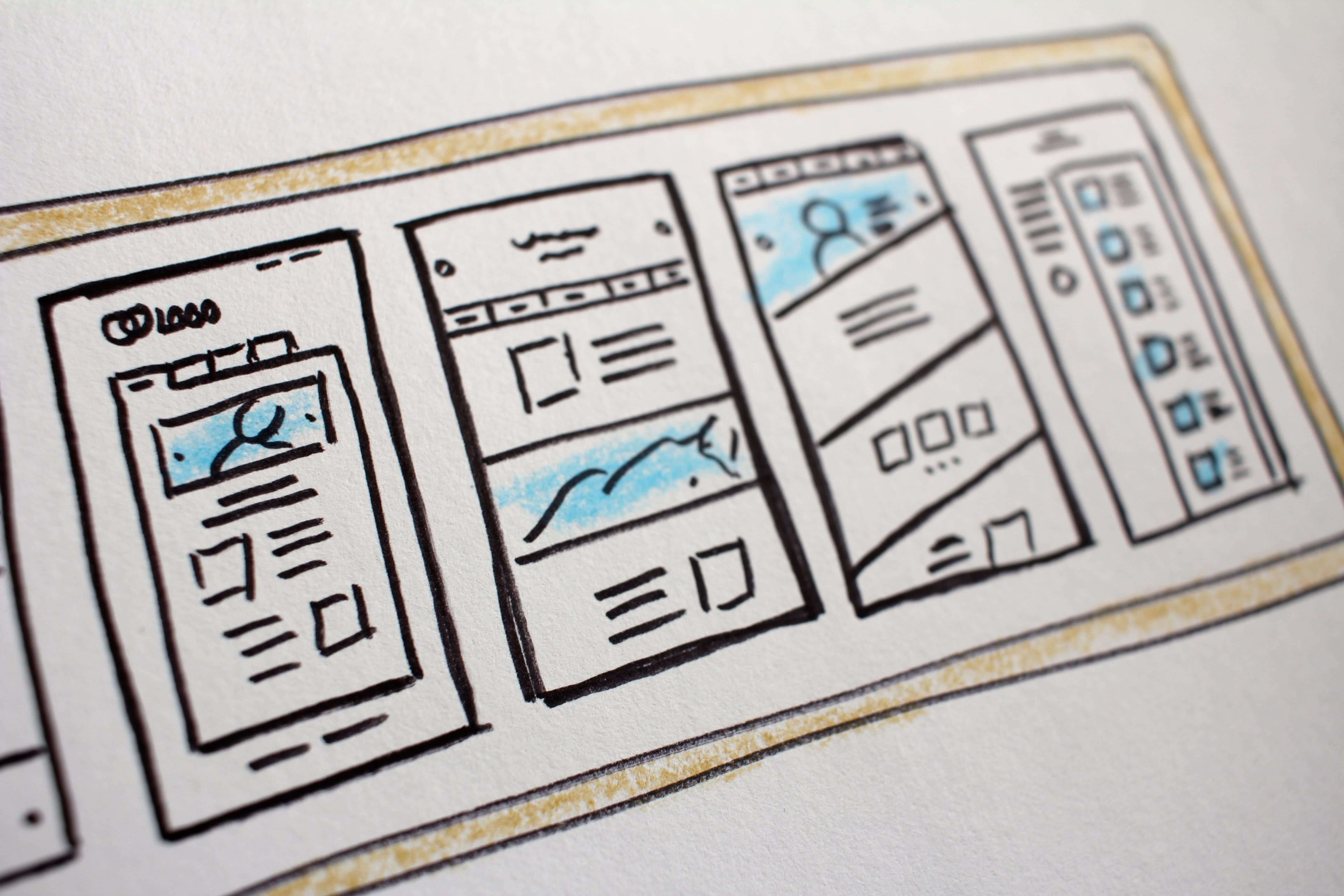
8. The Gap Between Graphics and Context
At first glance, it is obvious that images should clearly address the website's contextual part. Yet, many creators are still facing these web design mistakes when it comes to practice. The main goal of a website's graphics is to convey the message to the user in a straightforward yet visually attractive manner. Irrelevant and low-quality images are not working in your favor as they can muck up your web solution, turn off your audience, and damage your conversion rates.
SolidBrain Recommends:
-
Choose only high-quality images for your website design.
-
Some pieces of graphics may seem cute or eye-catching, but if they do not correspond to the context, it is always better to skip them.

9. Hard-to-Follow Content Layouts
Your content layout structure is decisive: it can lead the website to success or cause a total failure. Some designers just place a block of text on the page and totally ignore paragraphs, icons, graphics, lists, etc. In the modern oversaturated market, this technique does not work because website visitors do not enjoy scrolling down tons of text. Thereupon, hard-to-follow content layout techniques is another crucial point on the list of web design mistakes to avoid.
SolidBrain Recommends:
-
Keep the balance between visual and text content. Notably, incorporating too many visual elements may also be harmful.
-
Think from the perspective of the end-user: people want to know exactly where the information they need is.
-
Use margins to provide enough space between text blocks and images.

10. Non-Standard Screen Resolution
Creativity is an inseparable part of the design process, but it is not applicable to screen resolution. You have definitely visited web pages where you were expected to scroll horizontally. Accordingly, most users do not enjoy such an experience. In the world of web design, horizontal or non-standard screen scrolling is a 'mauvais ton,' so it is better to avoid it.
SolidBrain Recommends:
-
Optimize your design layouts to a standard resolution — 1024 x 768 pixels.
-
Always consider how your design elements look and feel on different screen sizes.

Long Story Short
Considering all of the common web design mistakes we analyzed in this article, it is clear that even the smallest shortcomings may not only harm the look and feel of the website but also eventually lead to more severe business issues, such as low conversion rates or poor branding strategy. Summing up, just keep our helpful tips in mind when developing your next design and reach new heights. With SolidBrain, UX and UI design mistakes are not a matter to you anymore.
Are you ready for more useful insights on website design mistakes? Then, submit the contact form, grab your chance, and be the first to receive our valuable blog updates. Stay aware, stay safe.